Citation Award
Project Name: UNR Chemistry/Physics Building Renovations
Architect: VanWoert Bigotti Architects
Category: Interior
Location: University of Nevada, Reno
PURPOSE
This project involved remodeling one floor of the existing Chemistry Building and one floor of the existing Physics Building located on the University of Nevada, Reno (UNR) campus. These buildings were built in 1968. UNR selected the first floor of the Chemistry Building and the third floor of the Leifson Physics Building to receive these remodels. Each floor had its challenges due to the existing concrete structure, columns, and floors. The goal was to revise the floor plans to gain as much usable space into the laboratories as possible. The plans for both buildings included multiple labs, office space for staff, and grad space for students, along with updated, code-compliant restrooms and conference rooms. Each design is uniquely different and derived from the basic fundamentals of chemistry and physics.
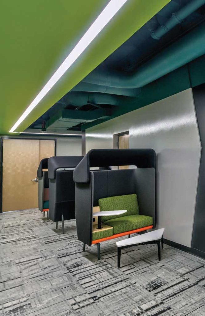
Using distinct color and finish palettes for each department, the building has received a fresh look to bring it into the 21st century. The furniture was part of the contract and designed with the student in mind to fit the spaces, keeping both design concepts distinct and holistic.
UNIQUE ASPECTS
Both buildings are available to the students on a 24:7 basis. Therefore, it was important to provide an environment conducive to providing an energized environment. In addition, the content of the program functions required the use of most of the square footage leaving the layout as a more traditional double-loaded corridor.
A NEW IDENTITY
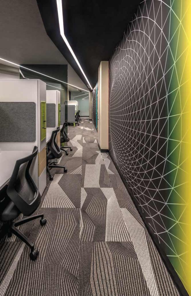
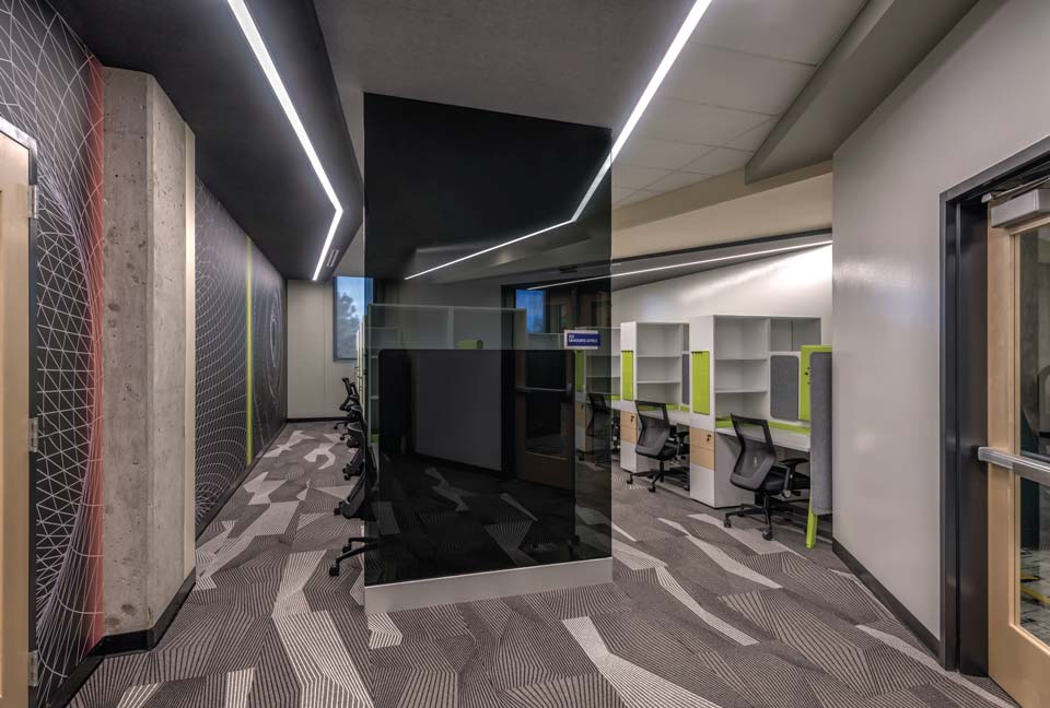
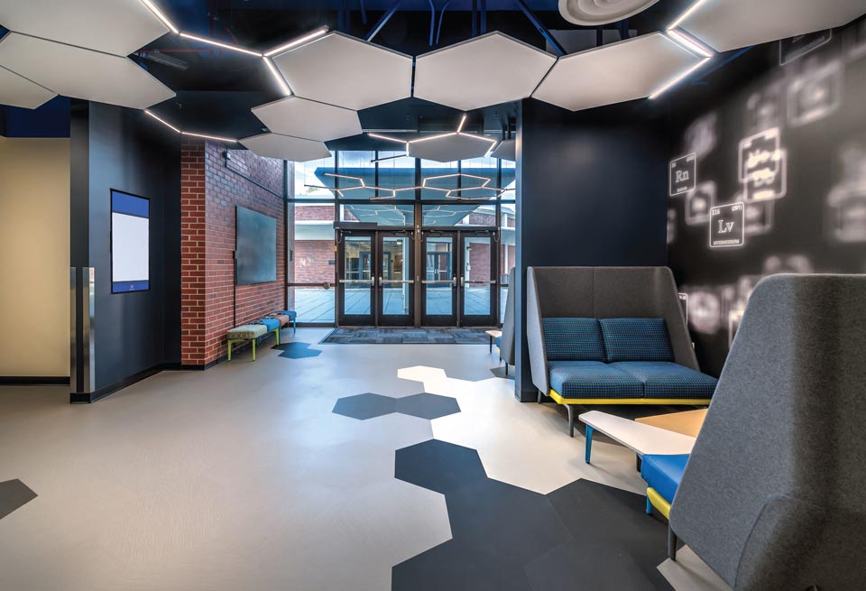
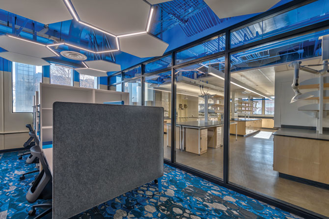
The design team opted for a solution that was driven by academics. Both Chemistry and Physics refer to formulas and graphic representations of molecular structure and formulaic data. The interior environment is composed to inspire — creative thought, scientific study, and 21st century learning. After much research and careful coordination with material suppliers, the design palette was created. Custom wall-coverings, magnetic whiteboard paint, furnishings, fabric, and creative light selections combine to provide innovative design for each floor that collectively make up a solution that offers a complete transformation for those areas. This transformation provides collaborative spaces, connectivity by way of interior glass, visually interesting color combinations, and an entirely fresh look that attracts and retains students.
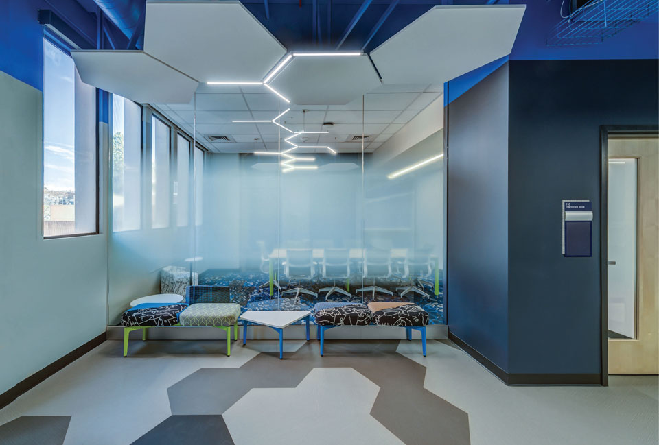
For the Chemistry level, the structural formula of a chemical compound was graphically represented. For instance, the atomic pattern of Hexagons can be seen subtly in some surfaces and more clearly in elements such as the light fixture layout. This chemical bonding aesthetic provides an environment that is fitting to inspire the teaching and learning for both staff and students alike. The color palette for this first-floor location reflects UNR’s school colors to maintain school pride and a timeless campus identity. Similarly, for the Physics level, the design team applied the pictorial representation including lines, rays, and angles of color as a reference to Spectrum and Data. Line graphs describe motion and patterns of force and light.
Each floor has a similar approach yet a unique individual identity. Spaces were arranged and detailed in a way that function was provided with pops of color, texture, and pattern to add interest to an otherwise traditional and often mundane double-loaded corridor layout.
BUDGET
Due to the aged nature of the building and its systems, the structural, mechanical, electrical, and technological retrofits consumed considerably more of the budget than was planned, leaving a marginal amount remaining for the interiors. The interior architectural concept utilized the typical materials in an affordably customized manner for a creative result.
2021 AIA Nevada Juror’s Commentary
“When performing renovation work within buildings that many local residents have a fair amount of personal connection to and history within, additional challenges always fall over the design team to ‘not mess it up.’ In this circumstance, the design team tastefully respected the positive elements of the existing architecture and created a more interactive and updated version of the original. Included in this project is the purposeful deconstruction of the ceiling treatment to expose the physical systems of the building itself, an element ringing true to the critical identity of the building itself, the Chemistry/Physics Building.”
It’s not often that upon entering an education building on a college campus, the interior of the space alludes to the nature of classes held in the facility in such an innovative way. Rather than relying on signage, the Design Team chose a less heavy-handed approach and integrated materials thoughtfully to envelop students in a space that elegantly alludes to the nuances and beauty of scientific motifs.
